 Back to Projects
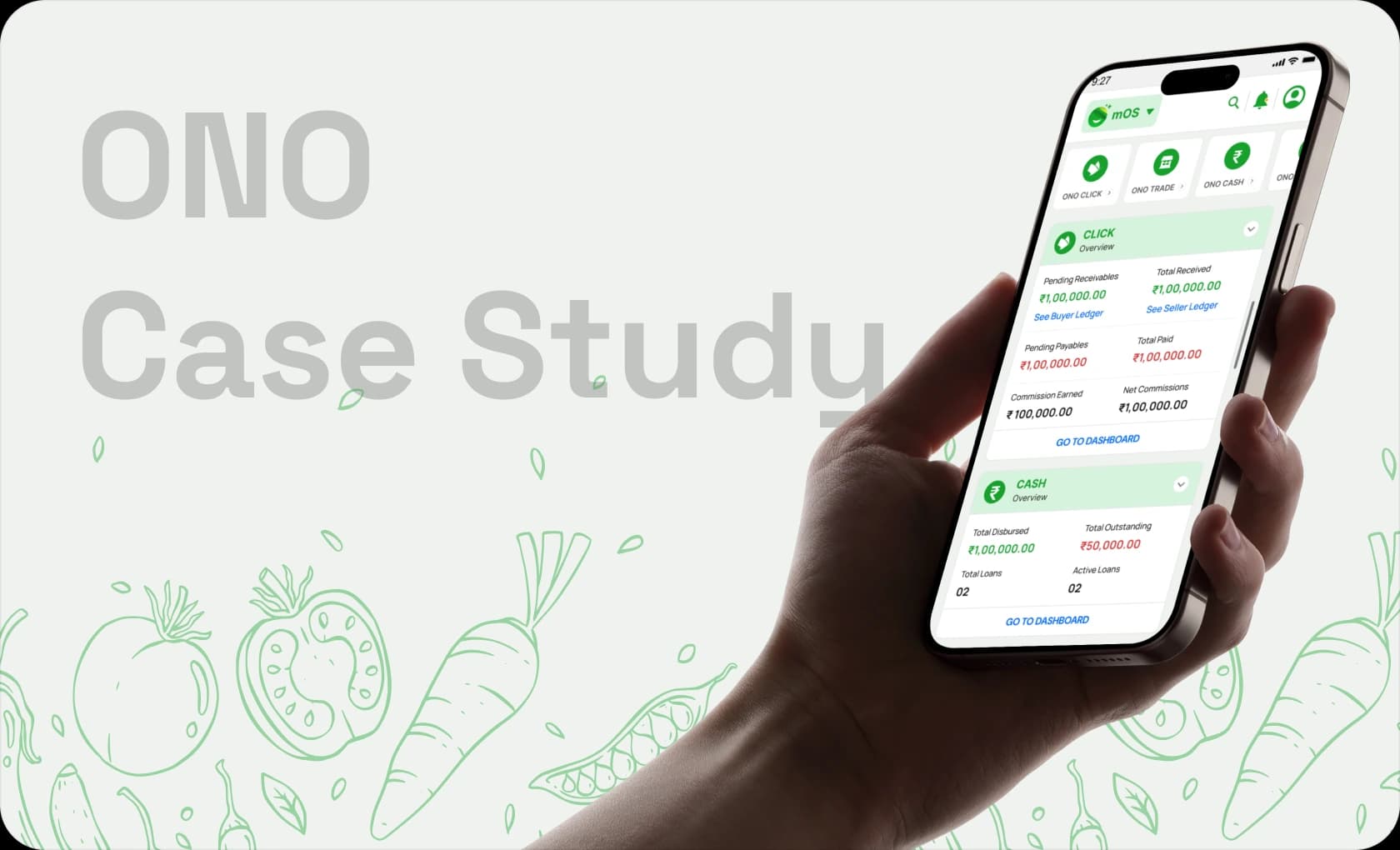
ONO is an agri-tech startup building products for agricultural trading, bookkeeping, credit and operational management.
Agri-tech • B2B SaaS • Ecosystem Design
Designing connected experiences for India’s agri-commerce ecosystem.
Helping commission agents and traders navigate multiple products through one connected experience.
02 / TL;DR
The story in four lines.
Users perceived ONO as multiple disconnected products instead of one connected ecosystem.
Worked closely with founders, product managers, developers and QA to build connected experiences across products.
Improved product discoverability and reduced friction across the ecosystem.
03 / Project Snapshot
At a glance.
8Months embedded with the team
2Major products — mOS + CASH
1Unified ecosystem of connected journeys
4+Cross-functional stakeholder groups
Role
In-house UI/UX Designer
Category
Agri-tech Startup
Location
Bangalore
Duration
8 Months
Team
Founder · Product Managers · Developers · QA
Responsibilities
Product Design · UX Strategy · Design Systems · Cross-functional Collaboration · Developer Handoff · Iteration Support
04 / Understanding ONO
Building for users who weren’t digital natives.
Most users were commission agents and traders operating within India’s mandi ecosystem — many of them first-time digital users. The challenge wasn’t adding features; it was bringing technology in without adding complexity. The products had to feel approachable, familiar and trustworthy.
FarmersCommission AgentsTradersONO Products
05 / The Bigger Problem
A fragmented ecosystem created friction.
Low Product Awareness
Users only knew the product they initially installed.
Fragmented Experiences
Multiple products created multiple entry points.
Low Cross-product Adoption
Users rarely explored other ONO products.
Disconnected Journeys
Switching products interrupted workflows.
06 / mOS — Deep Dive
Unifying ONO’s ecosystem under one roof.
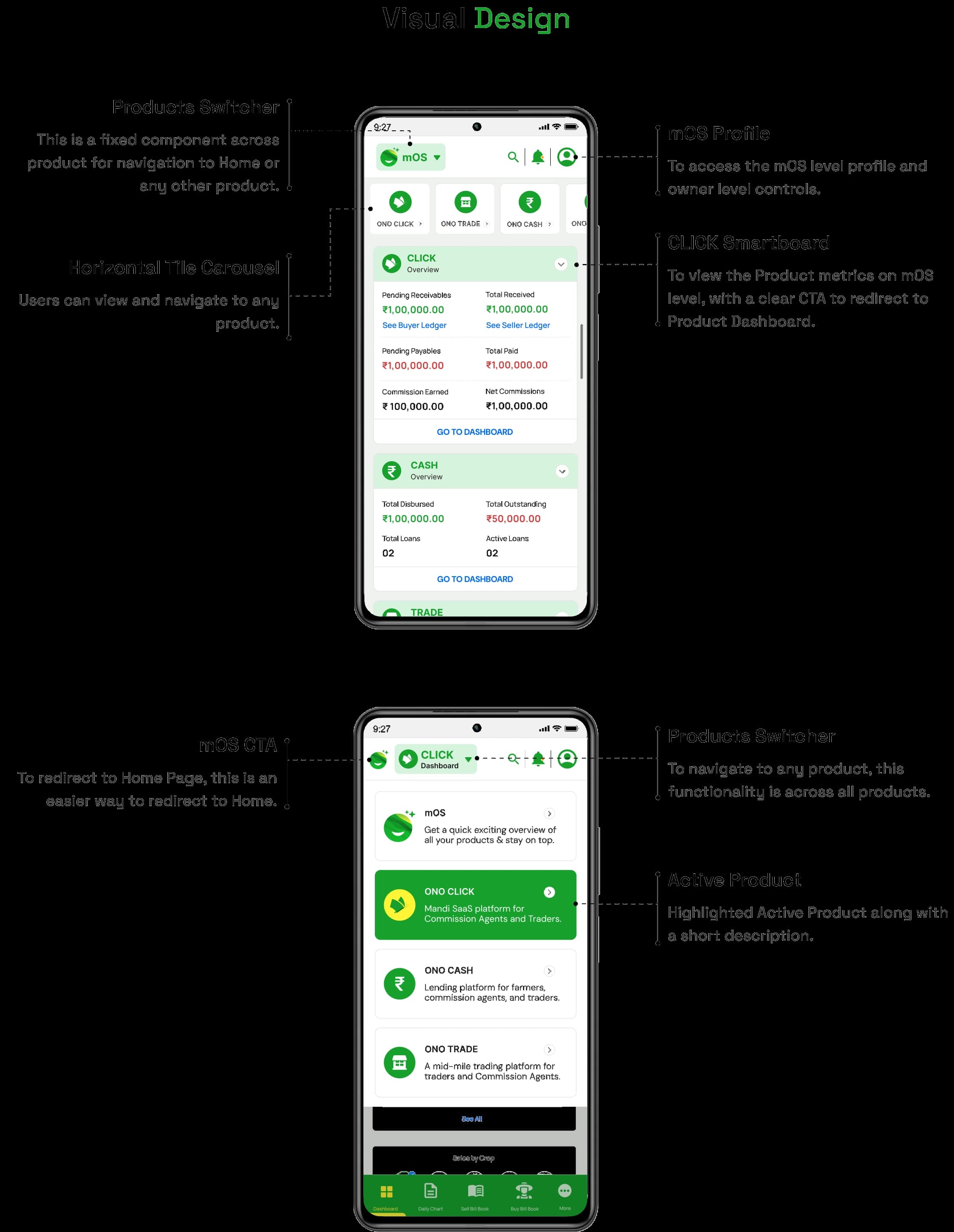
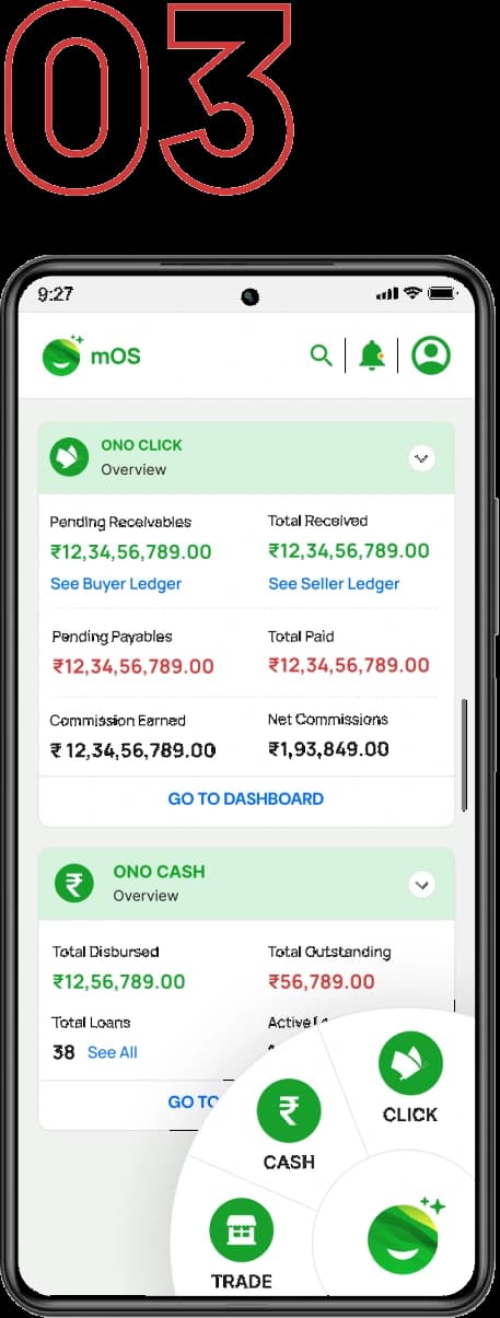
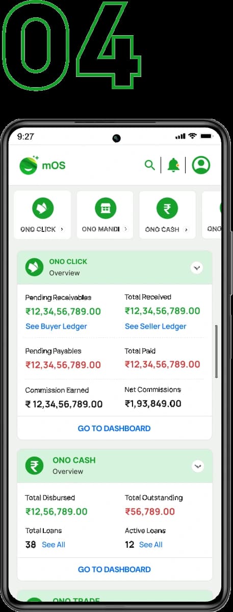
mOS is a central operating system that connects ONO’s products into one experience. Instead of juggling multiple apps, users get a single entry point — cutting friction while making the rest of the ecosystem easy to discover.
Key Decisions
Dashboard over navigation overload
ProblemMultiple products meant multiple menus to learn.
DecisionA single dashboard as the home for everything.
ReasonOne predictable place beats many scattered entry points.
Product discovery made visible
ProblemUsers only knew the one product they had installed.
DecisionSurface the rest of the ecosystem on the dashboard.
ReasonYou can’t adopt what you can’t see.
Reusable components for familiarity
ProblemEach product looked and behaved differently.
DecisionA shared component library across mOS.
ReasonFamiliarity lowers the curve for first-time digital users.
Business goals aligned with user goals
ProblemGrowth targets could have meant pushy cross-sell.
DecisionMake discovery helpful, never promotional.
ReasonAdoption sticks when it genuinely serves the user.
Inside mOS
07 / Navigation Exploration
Exploring multiple ways to connect products.
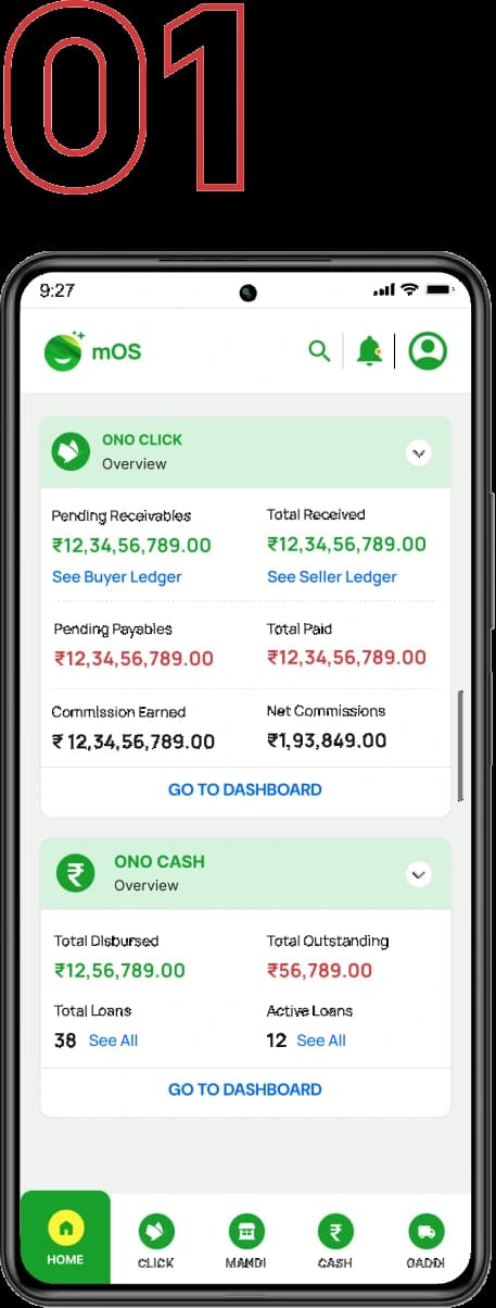
Tab Navigation
Not scalable as the product set grew.
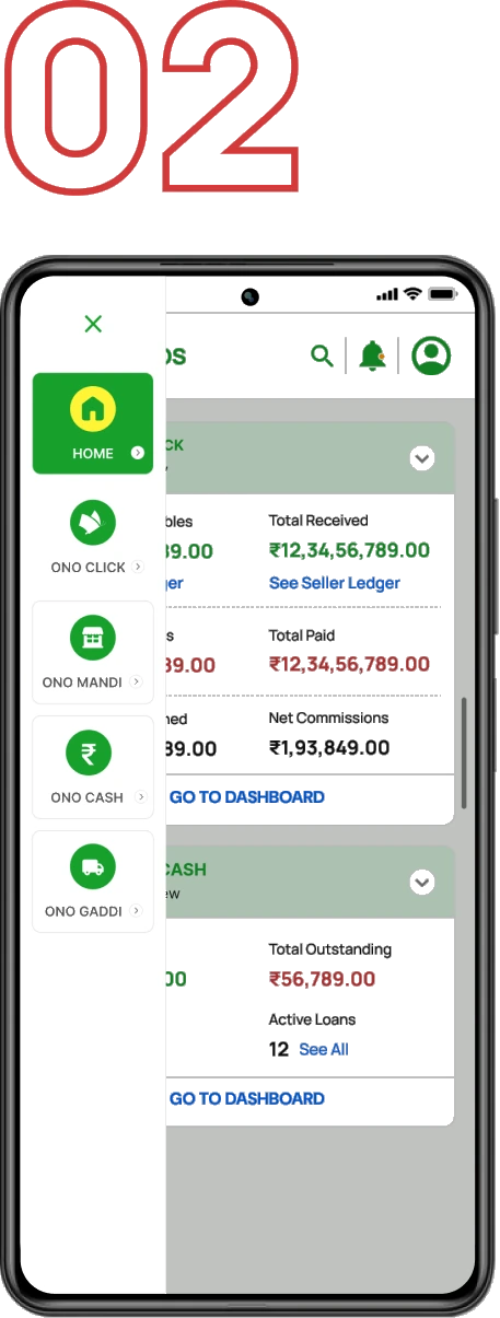
Hamburger Menu
Poor discoverability — options stayed hidden.
Floating Action Button
Hidden actions users rarely found.
Horizontal Product Carousel
Scannable, scalable, and surfaced products in context.
08 / CASH — Deep Dive
Making financial products easier to understand.
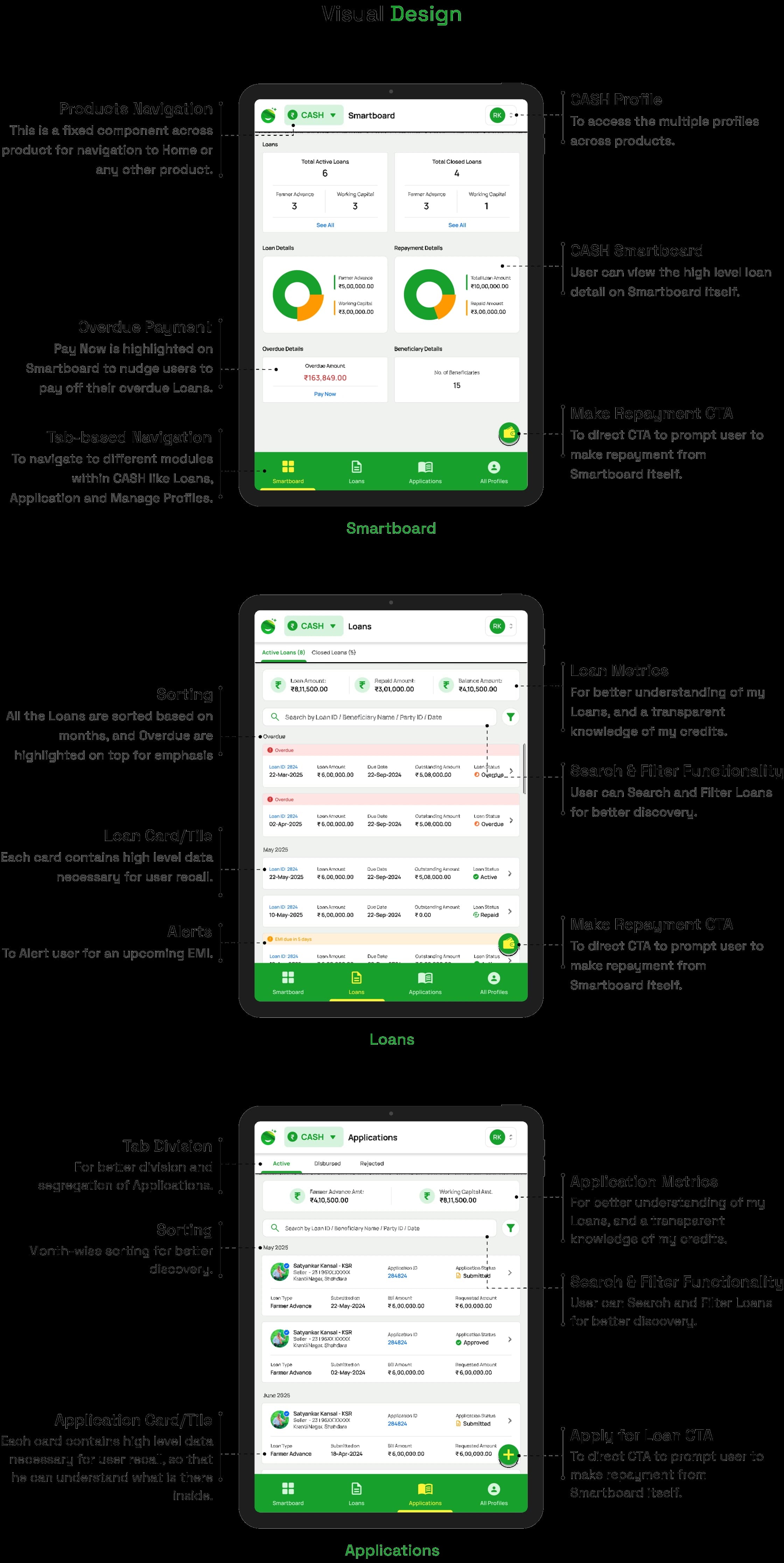
CASH is ONO’s lending product — it helps users apply for loans and manage repayments. The existing experience lacked hierarchy and clarity, so the rework focused on trust, visibility and self-service.
What users struggled with
Loan Status
No clear answer to “where does my loan stand right now?”
Repayment Tracking
Hard to tell what was due, paid, or still pending.
Outstanding Amounts
The total a user still owed was buried.
Application Progress
No visibility into where an application was stuck.
Key Decisions
Bring summaries upfront
ProblemKey numbers were buried inside sub-screens.
DecisionLead with balance, dues and status at the top.
ReasonThe most-asked questions deserve the most prominent space.
Separate loans and applications
ProblemActive loans and pending applications were mixed together.
DecisionSplit them into distinct, labelled spaces.
ReasonDifferent states call for different actions.
Increase repayment visibility
ProblemUsers couldn’t tell what was due or already paid.
DecisionMake repayment timelines explicit and scannable.
ReasonClarity around money builds trust.
Reduce dependency on support
ProblemEvery small question became a support call.
DecisionAdd self-service status and history.
ReasonSelf-serve answers scale; support calls don’t.
Before & After
 Before
 After
AfterInside CASH
09 / Systems Thinking
Beyond individual screens.
The biggest lesson from ONO was that products rarely exist in isolation. Building ecosystems meant balancing users, business priorities and technical constraints at the same time.
Ecosystems are products too.
The connective tissue between apps needed as much care as any single screen.
Discoverability drives adoption.
People only adopt what they can actually find.
Complexity stays behind the scenes.
The system can be intricate; the surface has to stay calm.
10 / Outcomes
What the work changed.
Increased product awareness
Reduced switching friction
Improved cross-product adoption
Better stakeholder alignment
11 / Reflection
Key takeaways.
Closeness with founders accelerated decisions.
Direct access meant fewer handoffs and faster, sharper calls.
Design systems matter more as products scale.
What felt optional early became the backbone across mOS and CASH.
Business problems reveal bigger opportunities.
The fragmentation pain pointed straight at the ecosystem opportunity.
Next Project