Back to Projects
Client Work • iOS & Android • 2026
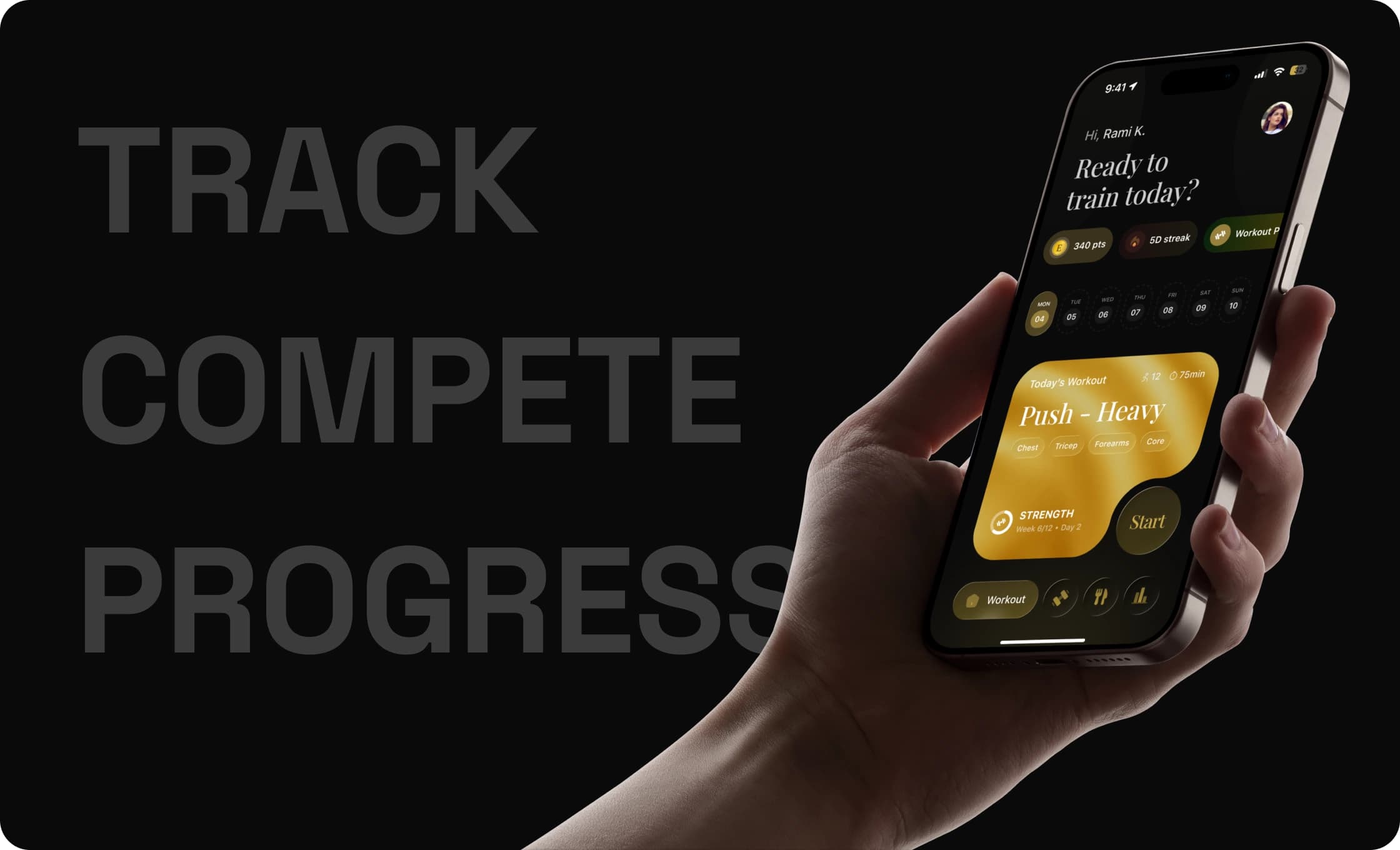
Designing a luxury fitness experience that makes consistency feel rewarding.
From workout logging to leaderboards and progress tracking, the goal was to create an experience that feels elite, motivating, and effortless to use.
Design Timeline
2 Week Sprint
Responsibilities
UX Strategy · 0 → 1 Product Design · Design System · Developer Handoff · Iteration Support
02 / My Role
Designing beyond screens.
As the Product Designer, my responsibility wasn’t just to create interfaces. I translated business goals into an experience that motivates users to return consistently and feel rewarded throughout their fitness journey.
- Product Thinking
- Defined experiences that prioritised motivation, consistency and long-term engagement over simple workout tracking.
- Experience Design
- Designed intuitive flows across workouts, progress tracking and competitive experiences.
- Visual Design
- Built a premium visual language that balances performance with luxury-inspired aesthetics.
- Collaboration
- Worked closely with stakeholders and developers to align design decisions with business goals and technical feasibility.
03 / The Challenge
Three goals, one screen.
Elite, not intimidating
Design for serious lifters without making newcomers feel excluded.
Progress should feel rewarding
Every action should reinforce consistency and celebrate progress.
Utility should feel luxurious
Functional experiences shouldn’t feel clinical. Performance and aesthetics should coexist.
04 / Design Opportunities
Translating inspiration into product decisions.
Rather than reinventing fitness experiences, I studied what already worked and identified opportunities to combine utility with emotion.
ReferenceLearningApplied to the App
 Hevy
HevyFrictionless set logging keeps lifters in flow.
One-tap set entry, mid-workout.
 Ladder
Structured programs build commitment.
Guided flows with a clear next step.
 Gymverse
Visible progress drives return visits.
Progression surfaced as the hero.
 Home Workout
Low-friction defaults welcome beginners.
Sensible defaults so logging never stalls.
 Rolex
RolexLuxury lives in restraint and detail.
Generous space, quiet type, no clutter.
05 / Product Constraints
Designing within real-world limitations.
Good product design isn’t about unlimited possibilities. It’s about making thoughtful decisions within constraints.
Premium without excess
The product needed to feel elevated without becoming visually overwhelming.
Motivation without distraction
Gamification had to encourage progress without competing for attention.
Complexity without friction
Multiple features had to remain simple and approachable.
06 / Key Design Decisions
How I think, made explicit.
Performance Data Hierarchy
ProblemToo many metrics competed for attention.
DecisionShow one main metric per screen; demote the rest.
ReasonLifters scan, they don’t read, mid-set.
OutcomeFaster comprehension, calmer screens.
Workout Feedback Loop
ProblemLogging felt like data entry, not progress.
DecisionImmediate confirmation after every set.
ReasonSmall wins sustain motivation across a session.
OutcomeLogging feels rewarding, not clerical.
Achievement States
ProblemMilestones disappeared into history.
DecisionDedicated states for PRs and streaks.
ReasonRecognition is what brings people back.
OutcomeMemorable moments, not silent records.
Rest Timer Experience
ProblemTimers interrupted the workout flow.
DecisionA persistent, glanceable rest timer.
ReasonRest is part of the set, not a detour.
OutcomeUninterrupted rhythm between sets.
07 / Visual Execution
Bringing the experience to life.
Every screen was designed to reinforce motivation, minimise friction and strengthen the product’s premium identity.
08 / Collaboration Beyond Figma
Design didn’t stop at handoff.
Reviewed implementation
Walked builds against the designs and flagged drift early.
Resolved edge cases
Defined empty, loading and error states before they shipped.
Reduced ambiguity
Annotated specs so behaviour wasn’t left to guesswork.
Refined interactions
Tuned motion and feedback alongside the developer.
Answered questions
Stayed close throughout the sprint to unblock fast.
09 / Reflection
What I took away.
Premium is restraint.
The luxury wasn’t in more — it was in removing everything that wasn’t earning its place.
Fitness is movement-first.
Designing for a phone propped against a dumbbell rack changed every call I made about size and tap targets.
Collaboration ships.
Staying in the loop with the developer turned handoff from a wall into a conversation.